BRANDING FOR THE MINISTRY OF MEDIA
新广电总局
Rebranding for the State Administration of Radio Film and Television (SARFT) in China, the government organization that decides what content can or can not to be shown in public. (The big boss behind all those banned movies.) For such a powerful ministry, I think they deserve an official and authoritative identity to represent them — but one that reflects a more modern attitude to content and transparency in their decisions.


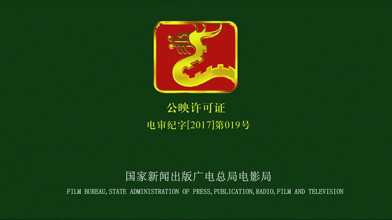
ORIGINAL LOGO
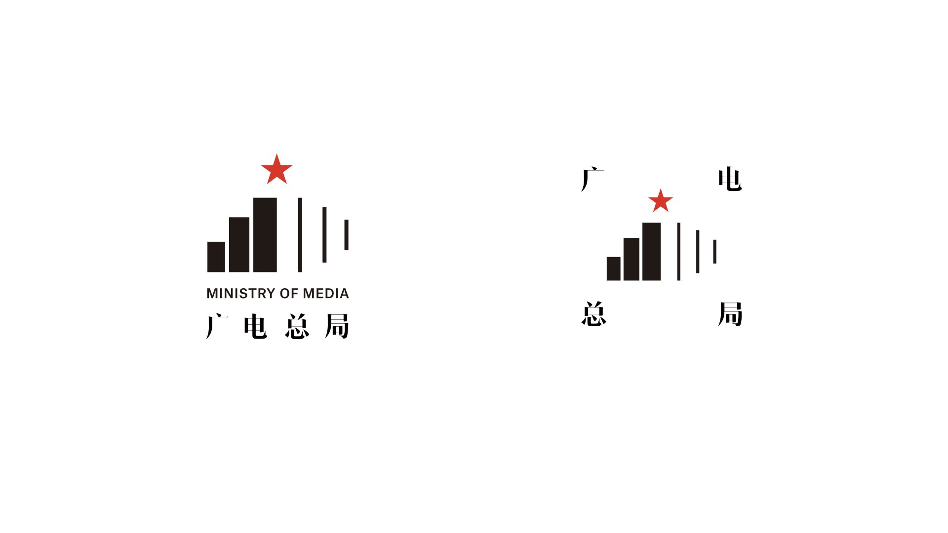
LOGOS

I used rectangles to reference the SARFT building itself.
And I kept the star on top as the party or government building.
The negative space between the buildings became the signal bar
on the right. The primary logo is mostly used for external systems,
while the secondary logo mostly intended for internal use.

PRIMARY & SECONDARY
EXTERNAL STRATEGY
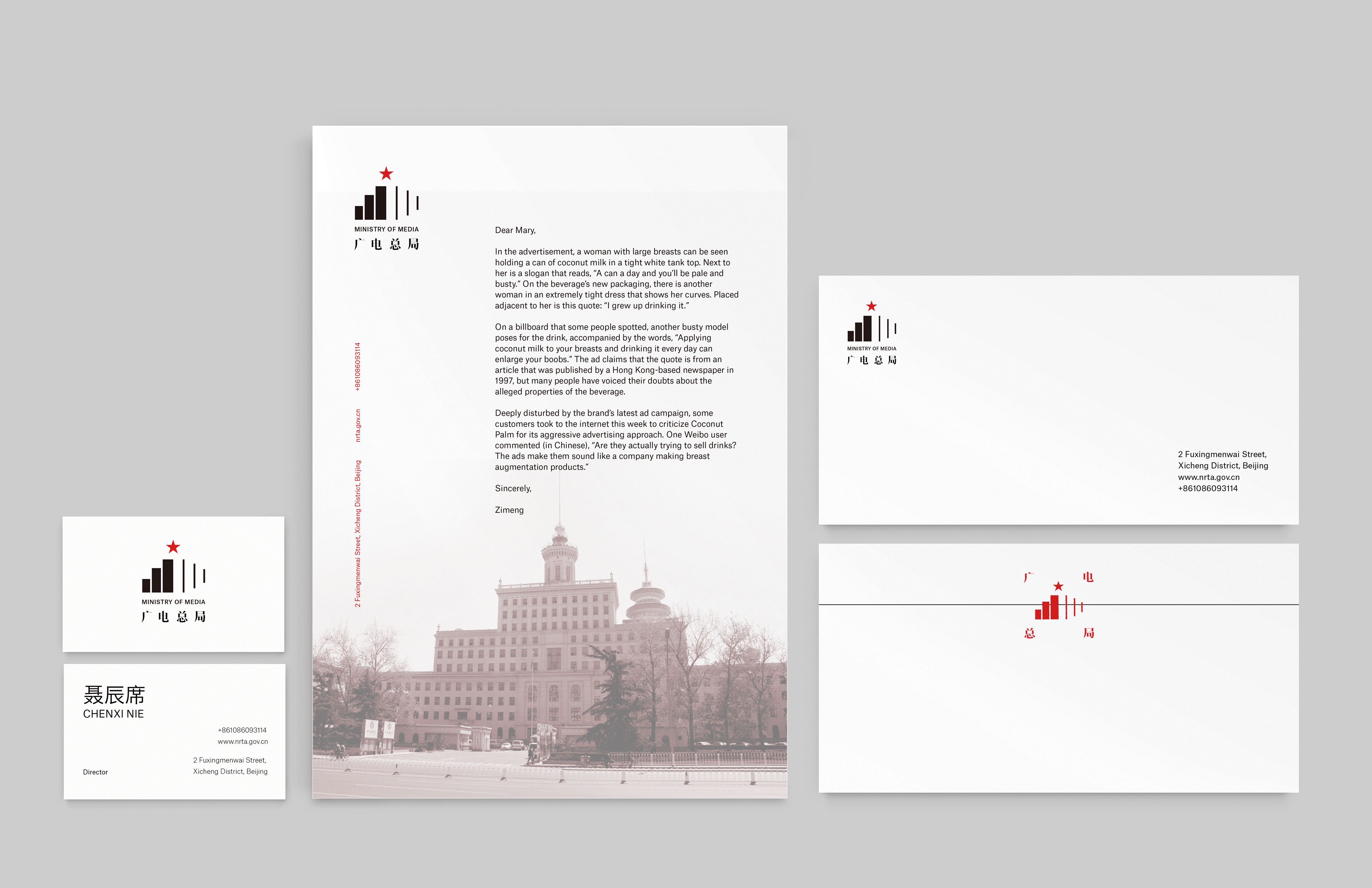
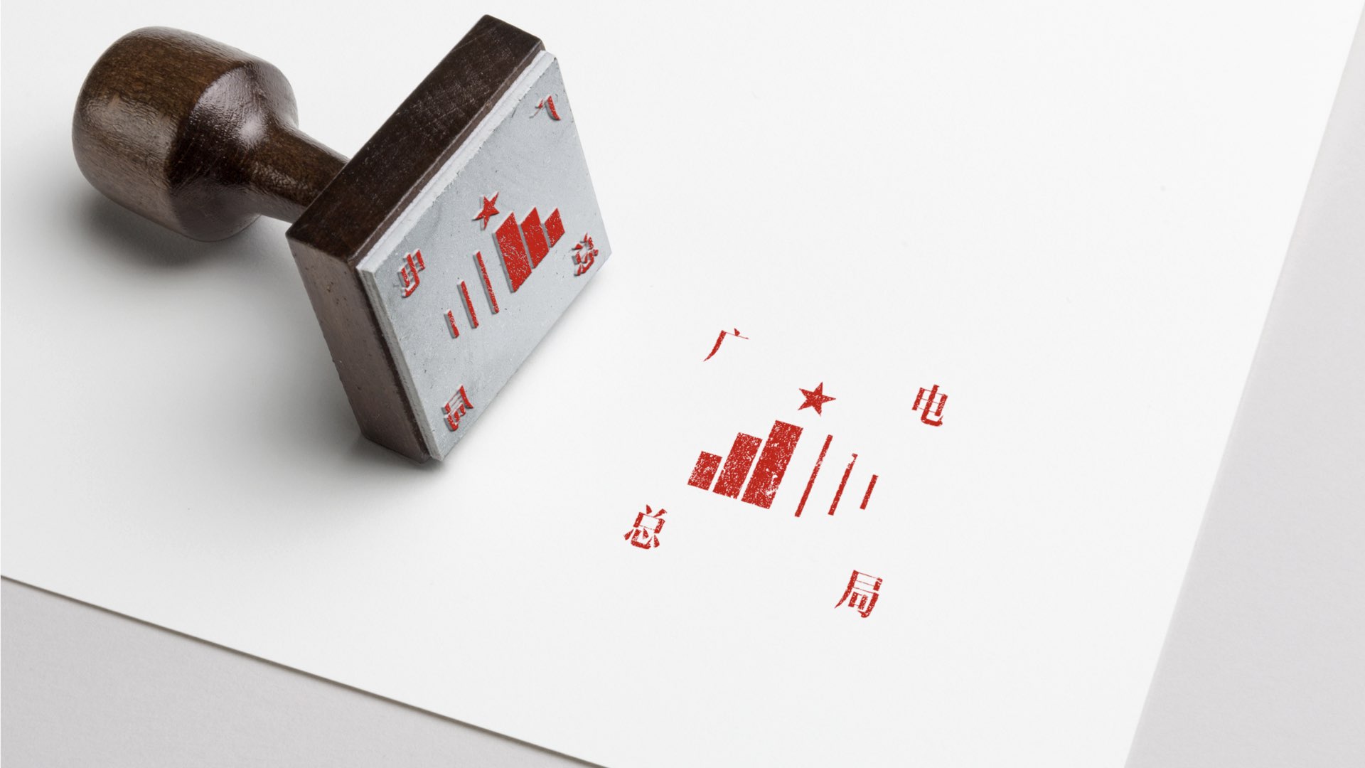 The 4 characters of the Chinese name on the 4 corners
 refering the stamp for offical approval.
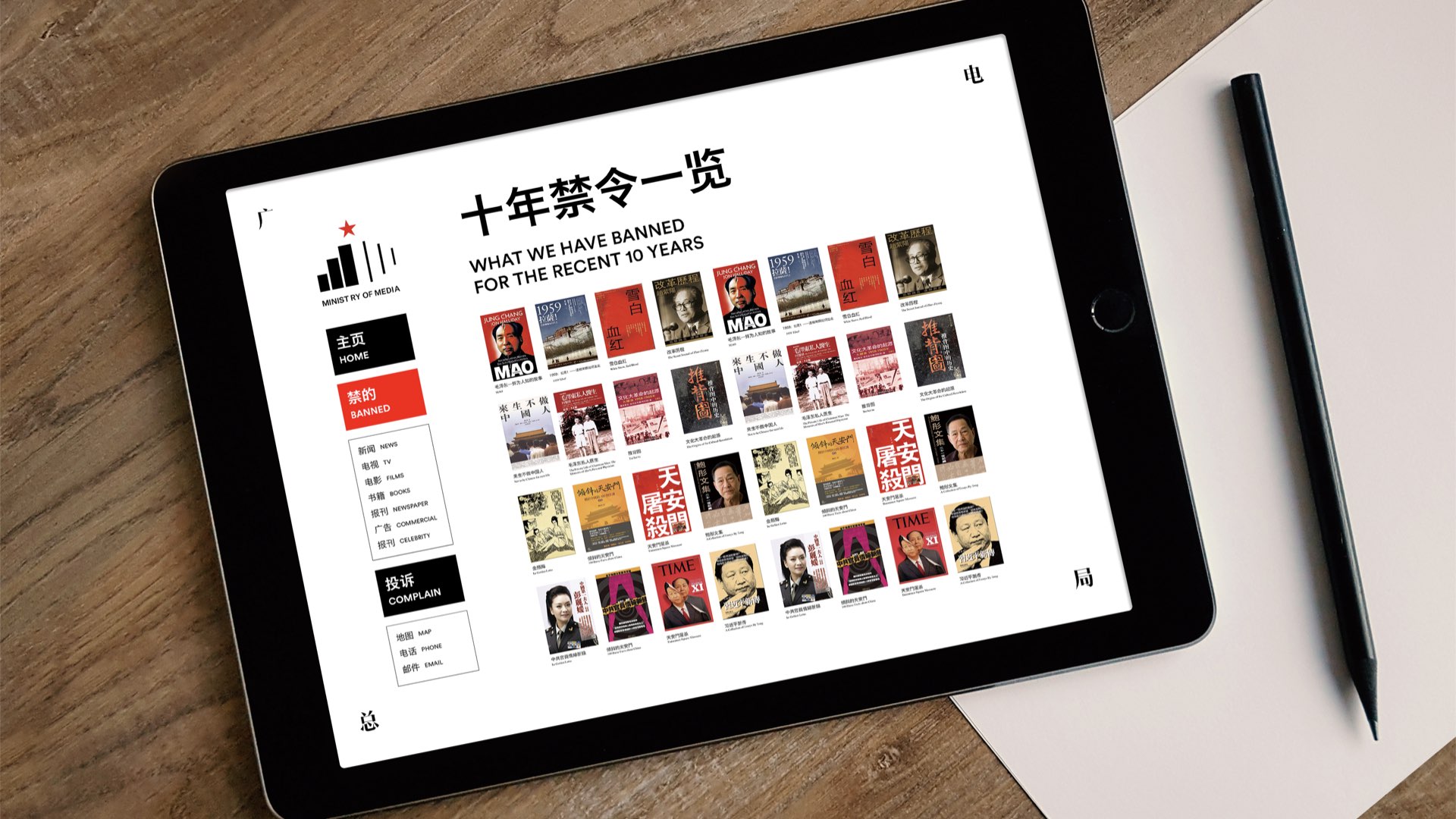
I’m also proposing a new official website to improve the transparancy,
by listing what they have been banned and why. People can look up
to understand more and even make a complain at the website.
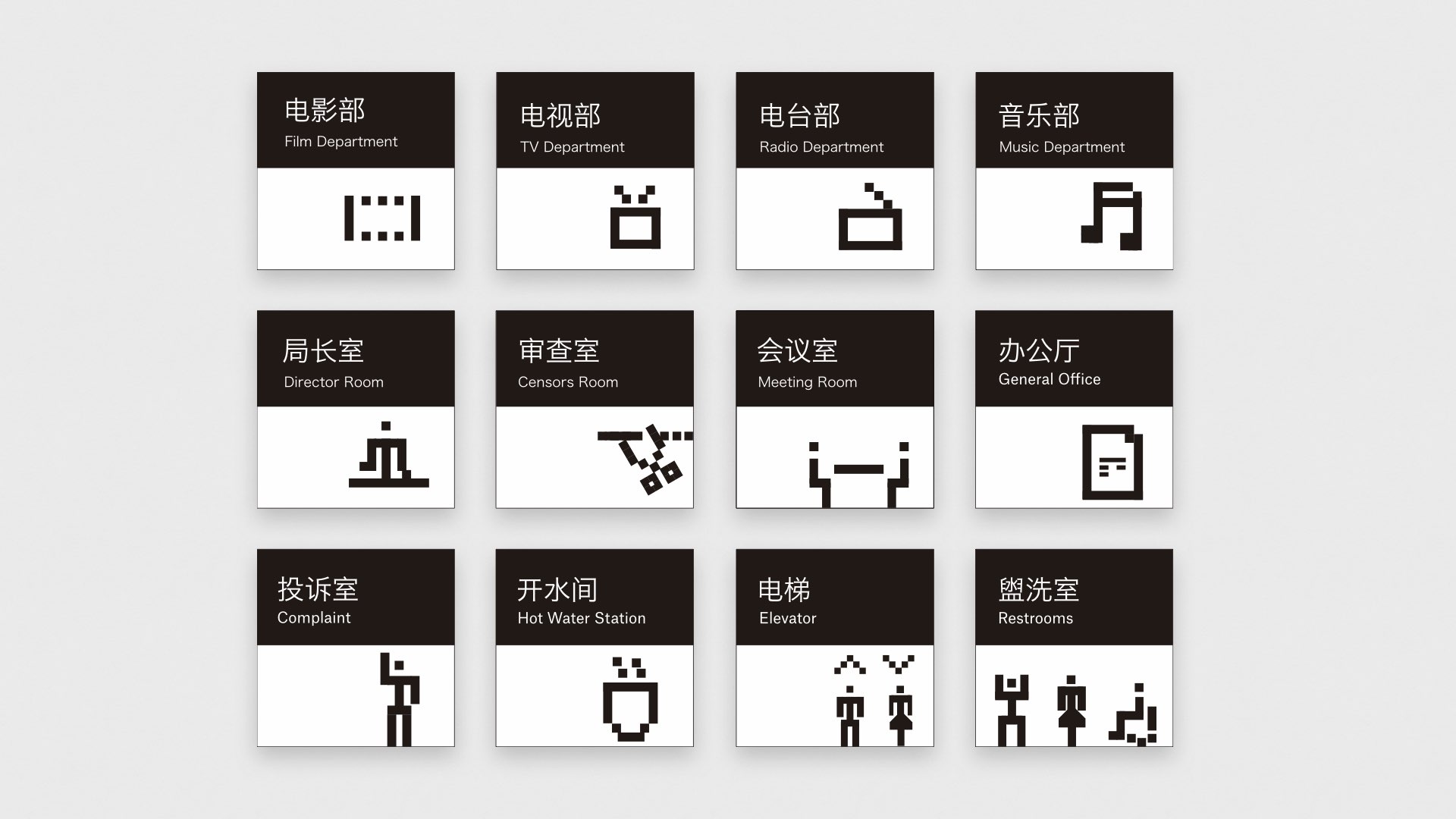
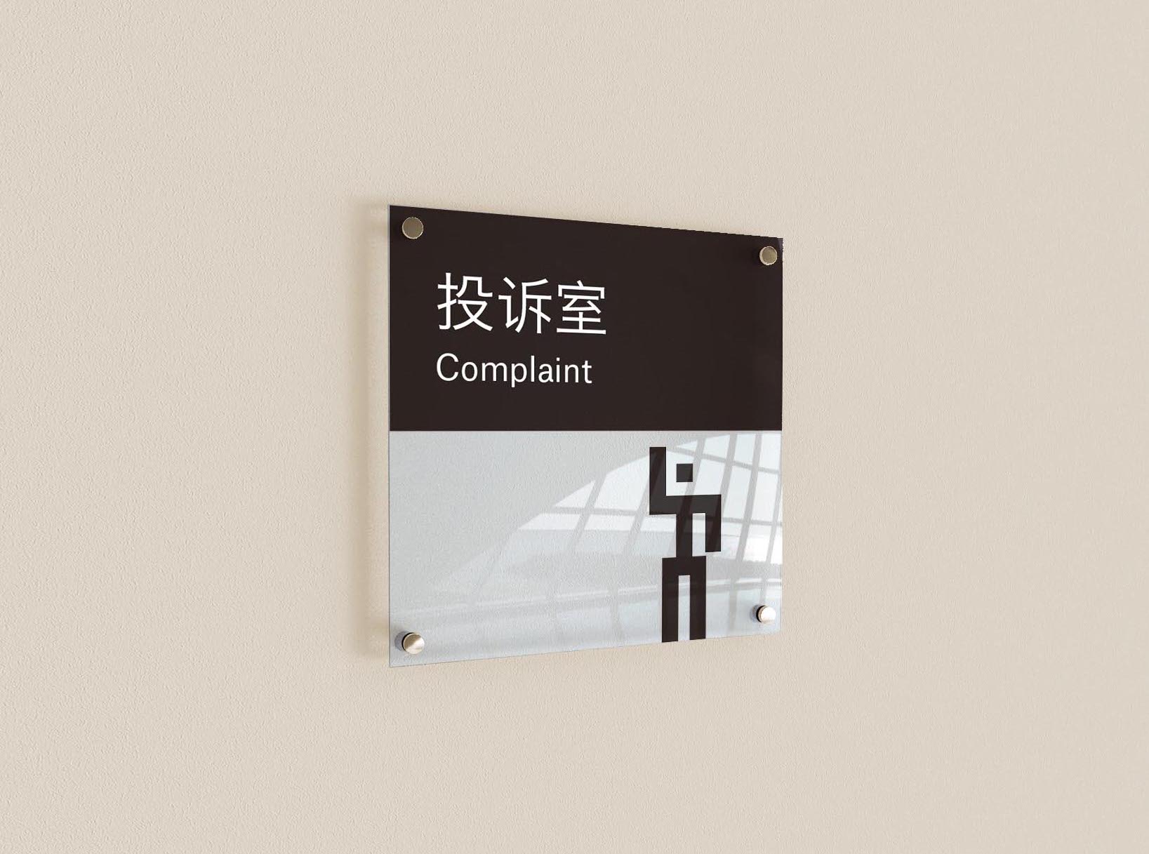
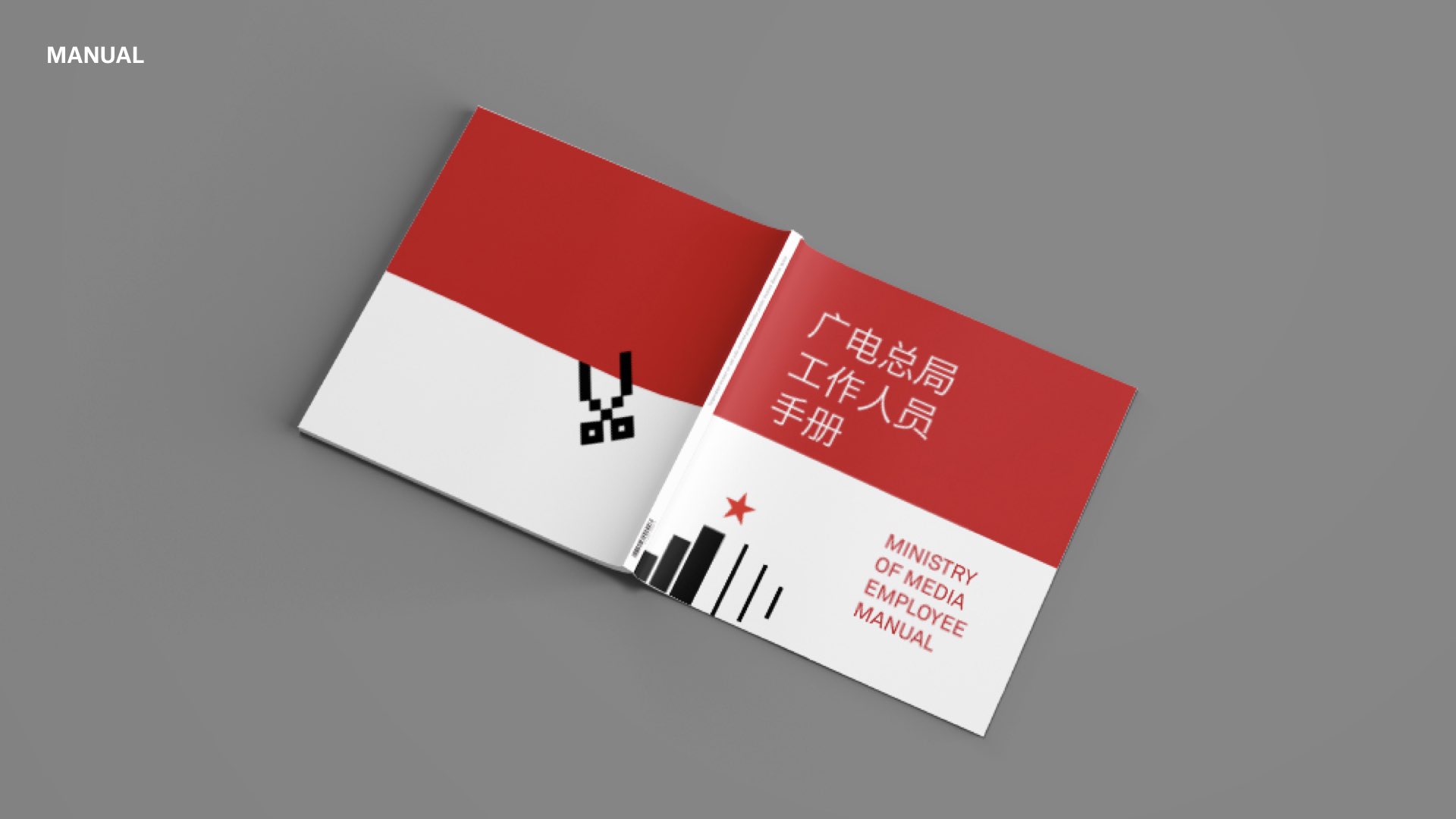
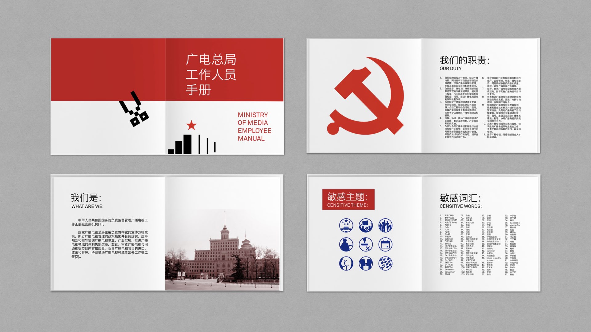
INTERNAL STRATEGY


A less formal, fun visual system for internal design.
Inspired by led screen in China and the pixelization scenes on TV.


STAFF MANUAL
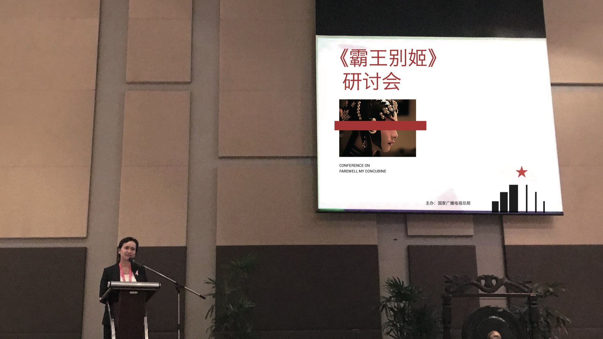
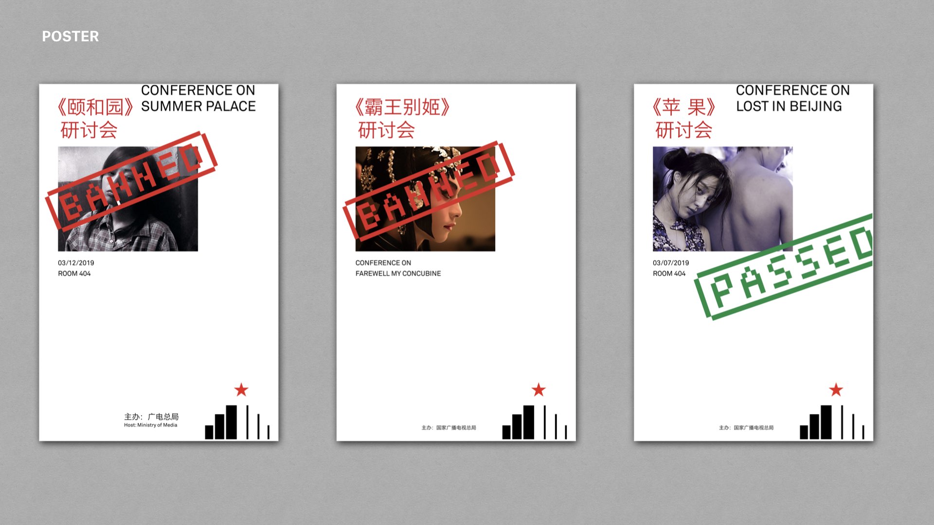
CONFERENCE POSTERS
LOGO ANIMATION